Quivva
Quivva is my own product. Building its marketing site meant being my own client. Which turns out to be a different kind of difficult.
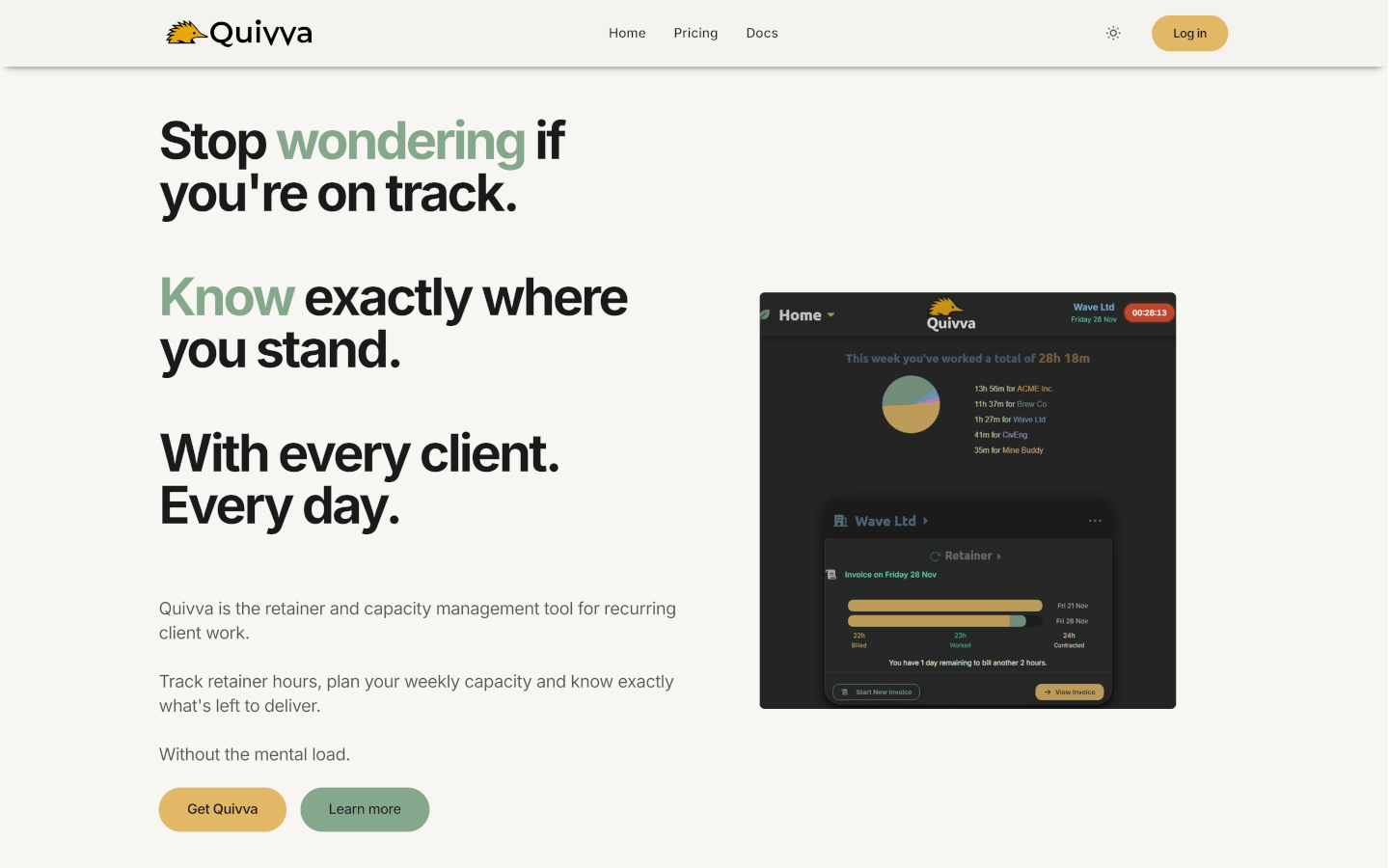
Quivva is a retainer and capacity management tool for independent consultants. I built it to support my own consulting business, which meant the intended audience was other solo consultants like me. My peers, not strangers. That made the messaging unusually direct: I wasn’t guessing at their problems, I’d lived them.
But being your own client has its own difficulty. I had to make the same decisions I ask clients to make: who is this actually for, what do they need to understand before they’ll trial it, and what’s the one thing the site needs to say?
The structure is deliberate. An emotional hook leads, followed by the outcomes Quivva delivers, then a clear signal about who the tool is and isn’t for, then a brief explanation of how it works, then an invitation to start a free trial. Feature detail was intentionally kept off the front page — it lives in a separate Features section for visitors who want it. A Docs section doubles as evergreen SEO content and a support resource for existing users.
The design was intentionally similar to that of the app. I didn’t just want consistency, but also wanted to pre-screen users for the unique app UI design. If the visitor is drawn in by the marketing site, they will enjoy the app.
The SaaS product itself runs on a .NET backend with a Vue frontend. The marketing site is intentionally separate: fast, static, and built for conversion rather than feature coverage.